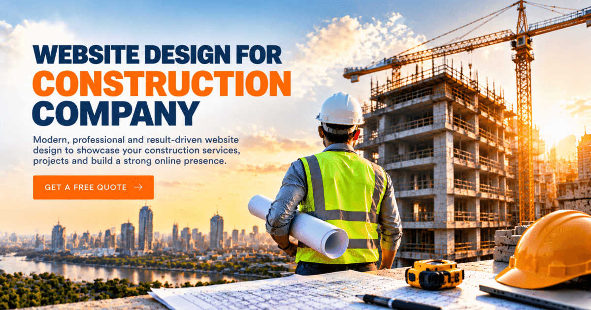
Here’s something most builders don’t enjoy hearing. Your work can be excellent, your crew can be the most reliable around, and you can still lose jobs to a company that does average work but has a better website. It happens more often than you’d think.
The reason is simple. Customers can’t walk onto your job sites before they call. They look at your website first, and they decide in a few seconds whether you seem worth a phone call. That’s why the choice you make about website design for construction company projects ends up shaping who contacts you and who quietly clicks away.
This guide is written for busy owners, not tech people. No code talk, promise. We’ll go through what to look for, what to skip, what to ask a designer and how to avoid paying for something that looks pretty and does nothing. Along the way we’ll look at how construction company website design affects trust, enquiries and the kind of customers you attract.
Why Your Website Is Doing More Work Than You Realise
Think about the last time you needed a plumber or a mechanic. You probably opened two or three sites, skimmed them and picked one. It took about thirty seconds. Your customers do the same thing when they look for a builder, except the money involved is much bigger.
A good website design for construction company owners gives people quick answers. What do you build? Are you a proper, licensed business? Can I see a job like mine? How do I reach you? If those answers aren’t easy to spot, most people won’t dig around. They’ll go back and try the next name on the list.
Money is part of it too. Hiring a builder can cost more than buying a car. Nobody feels comfortable handing that over to a firm with a broken contact form and photos from ten years ago. Your website is basically the first test, and a lot of companies fail it without ever knowing.
Work Out What the Site Is For First
Lots of owners start with colours and logos. That’s the fun part, so it’s understandable. But it works better to start with a plain question: what do I want this site to do for my business? The strongest website design for construction company work always starts from that answer.
Who Are You Trying to Reach?
Someone redoing a kitchen cares about different things than someone putting up a new shop unit. The homeowner wants to feel at ease and know you’ll turn up when you say you will. The business client wants to see licences, past big jobs and proof that you finish on schedule. Pick your main audience and write for them. Try to speak to everyone and you usually end up speaking to nobody.
What Should a Visitor Do Next?
Every page needs one main next step, such as calling you, asking for a quote or booking a visit. If five different buttons are all fighting for attention, people freeze. Choose one and make it obvious.
Think a Little Ahead
You might add new services in a year or two. Ask whether the design can handle extra pages without looking messy. Rebuilding from scratch every couple of years is an expensive habit, and a bit of planning now avoids it.
What Does the Best Construction Company Website Design Look Like?
People often imagine the best construction company website design as something dramatic, with big videos and moving graphics. In real life it’s usually calm and plain. It loads fast, shows real work, and makes the phone number easy to find. Nothing clever, nothing confusing.
The table below shows the main parts of a good site, why each one matters and the mistakes that show up most often.
| Part of the Site | Why It Matters | Mistake to Avoid |
| Homepage banner | Sets the first impression of your work | Blurry stock photos that look fake |
| Menu | Helps people find your services quickly | Too many options that confuse visitors |
| Project gallery | Proves you can do the job | Tiny pictures with no details |
| Contact buttons | Turns visitors into enquiries | Burying your number at the bottom |
| Phone layout | Most people browse on mobile | Small text and crowded buttons |
| Page speed | Stops people from leaving early | Huge images that were never shrunk |
Photos That Are Really Yours
Visitors can smell a stock photo from a mile off. Smiling strangers in spotless hard hats don’t prove anything. Good website design for construction company pages use pictures of your own crew, your own sites and your own trucks. Even photos taken on a decent phone feel more honest than a glossy image anyone could buy. Before and after shots are gold, because they tell the story without needing many words.
Words Under the Pictures
Add a short caption to each project photo. What was the job, how long did it take, what did the customer want? Two lines is plenty. A caption turns a nice picture into proof.
One Page Per Service
If you do roofing, extensions and new builds, don’t squeeze them into one paragraph. Give each its own page. Visitors understand your offer better, and search engines do too.
Proof That You’re the Real Deal
Reviews, licences, insurance details, awards and years in business all help a nervous buyer relax. A friendly photo of the owner helps too, because people like knowing who’ll be in their home. Put this stuff near the top of the homepage and beside the contact form. Trust holds up every website design for a construction company that actually brings in work.
Construction Company Website Design Inspiration: How to Use It Without Copying
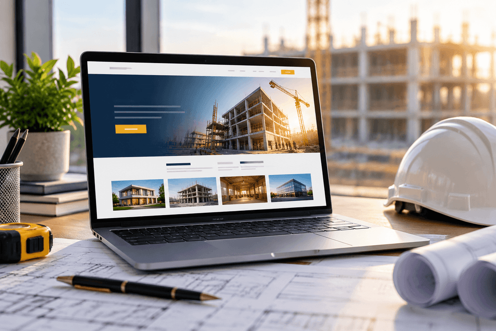
You rarely know what you like until you see it. Looking at construction company website design inspiration gives you a feel for what suits your brand. Check out ten or fifteen sites. Include other builders, but also architects, interior firms and home improvement brands. Notice what keeps you reading and what makes you want to leave.
Ask yourself a few simple things as you browse. How quickly did the page open? Could you find the phone number without hunting? Did the project photos look real? Did the writing sound like a person or like a brochure? Screenshot the bits you like. Those screenshots explain your taste to a designer far faster than a long phone call.
A warning, though. Inspiration is for ideas, not for copying. A smart website design for construction company borrows a feeling, never a layout. If you copy a competitor you’ll only ever be their cheaper twin.
Colours deserve a thought too. Plenty of builders go for deep blue, charcoal, orange or yellow, because those shades feel solid. Pick whatever you like, then use the exact same shades on your site, trucks, uniforms and business cards. A matching look makes a company seem organised before anyone has spoken to you.
Why Construction Company Website Design and SEO Belong Together
A beautiful site nobody finds is like a billboard in an empty field. That’s why construction company website design and seo should be planned together right from the start, not stuck on at the end. SEO just means making your site easy for search engines to understand, so it shows up when people search for what you do.
Here’s a story you’ll hear a lot. An owner pays for a gorgeous site, then months later realises it doesn’t appear anywhere in search. Fixing that afterwards costs extra and takes time. If search is part of the plan from day one, you save money and start getting enquiries sooner. Any serious website design for construction company should have the SEO basics built in from the beginning.
The table below explains the main SEO parts in everyday words.
| SEO Part | Plain Meaning | How It Helps You |
| Page titles | The headline shown in search results | Makes people click your listing |
| Headings | The bold titles inside a page | Helps visitors and search engines skim |
| Image names and alt text | Short descriptions of your photos | Helps your pictures appear in image search |
| Page speed | How fast a page opens | Keeps visitors and supports rankings |
| Phone friendliness | How the site looks on a small screen | Search engines favour sites that work on phones |
| Business details | Your name, service area and contact info | Helps nearby customers find you |
| Internal links | Links between your own pages | Guides people to more of your services |
Write for Real Questions
Search engines like pages that answer real questions. Talk about your services, how long jobs normally take, what pushes the price up or down and what a customer can expect. Keep the words simple. If a ten year old couldn’t follow a sentence, rewrite it.
Speed and Security
Slow sites lose people. Shrink your images, skip heavy add-ons and pick a reliable host. Make sure your site has a secure connection the little padlock in the browser bar. Visitors trust it more and search engines like it too.
Phones Come First
More than half your visitors will probably open the site on a phone, maybe standing on a job site or sitting in a parked van. Website design for construction company use needs big buttons, readable text and a phone number you can tap to call.
Keep Your Details Matching
Your business name, phone number and address should look identical everywhere online. That consistency helps people, and search engines, believe you’re a real, active company.
How to Pick a Construction Website Design Company
Now for the part that stumps a lot of owners. Who actually builds the thing? A good construction website design company understands your trade, not just design in general. Someone who has built sites for builders already knows people want to see projects, licences and a quick quote form.
Ask to see their past work. Do those sites load fast and feel trustworthy? If everything they’ve made looks the same, they probably reuse one template for everyone. That’s not what you’re after. When you compare proposals for website design for construction company projects, favour the team that asks about your customers before they mention fonts.
Then ask about SEO. A designer who ignores search will hand you something pretty that brings no calls. Ask how they handle speed, phone layouts and basic search setup. A clear, honest answer is a good sign. Vague promises aren’t.
Ask what happens after launch, too. Websites need new photos, updates and the odd quick fix. Find out who helps when something breaks and how fast they reply. And ask who owns the site. You should always own your domain name and your content.
Finally, talk about price and timing openly. A fair partner gives a clear quote, explains what’s included and says how long it’ll take. If the price looks suspiciously low, ask what’s missing. Very cheap usually means a recycled template, no testing and no support.
Also Read: How Construction Company SEO Services Help You Get More Clients
Mistakes That Cost Owners Money
Too Many Fancy Effects
Sliding banners, moving text and flashy animations look exciting in a demo. They also slow the site down and distract people. A common slip in website design for construction company jobs is chasing “modern” at the cost of clear. Simple wins.
Hiding Your Phone Number
If a visitor has to hunt for your number, plenty will quit. Put it at the top of every page and add a contact button that follows people as they scroll.
Thin Content
Some sites have a few lines of text and a handful of photos. That doesn’t convince a buyer or a search engine. Thin pages are a quiet killer for any website design for construction company. Explain your services, share short project stories and answer common questions honestly.
Skipping the Test Run
Open your site on an old phone with a slow connection, then ask a friend to try requesting a quote. If they struggle, your customers will too.
Letting It Go Stale
Old photos and out-of-date info make visitors wonder if you’re still in business. Add new projects, update services and keep reviews fresh. Even a small monthly update helps.
How Much Should You Spend?
No single price fits everyone. The cost of website design for construction company work depends on the number of pages, how custom the design is, the writing and photography needed and the SEO included. A small local builder with five or six pages will spend far less than a big firm with dozens of project pages.
Don’t chase the lowest number. Think about value. One new job from your site could pay for the whole build. Treat spending on website design for construction company projects as an investment that brings work in, not a bill that sits on the books. Ask how many enquiries you need each month and work backwards.
Keep running costs in mind too. Hosting, domain renewals, security updates and small edits add up over a year. A good partner explains these upfront so nothing surprises you.
Making the Final Call
When you’re down to two or three options, go back to your goals. Which one makes it easiest for your ideal customer to trust you and get in touch? Which gives you the clearest path to showing up in search? Before you sign, ask whether the website design for construction company you’re considering fits your business today and a year from now.
It also helps to ask each company for a rough plan. How many pages, what goes on the homepage, how they’ll handle photos. Put those plans side by side and you’ll quickly see who thought about your business and who just sent a template quote.
Trust your gut a little too. If a designer explains things plainly, listens and doesn’t rush you, that’s a good sign. If you feel confused or pushed, step back and keep looking.
Conclusion
Picking the right website design for construction company owners can rely on doesn’t have to be complicated. Start with clear goals, think about who you want to reach, and keep things simple, fast and honest. Use real photos, show your proof and make it dead easy for visitors to call or ask for a quote.
Design and search belong together. A site that looks great but can’t be found won’t grow your business, and that applies to any website design for construction company. Look at plenty of examples, learn from them, then build something that feels true to your company. Pick a partner who knows your trade, talks openly about price and sticks around after launch.
VM RankUp provides professional website design services for construction companies looking to build trust, attract potential clients, and generate more business inquiries. A well-designed website showcases your projects, highlights your expertise, and helps visitors understand why they should choose your company. Investing in professional website design for your construction company can strengthen your online presence, improve credibility, and turn website visitors into valuable leads for long-term business growth.
Frequently Asked Questions
How many pages does a construction company website need?
It depends on how much you offer, but most builders do well with a homepage, an about page, one page for each main service, a project gallery, a reviews page and a contact page. That’s usually between six and ten pages. You can always add more later as you take on new types of work. Start small and keep every page useful.
How long does it take to build a construction company website?
A simple site often takes four to six weeks. A bigger one with lots of project pages, custom features and fresh photography can take two to three months. Most delays happen because the owner is slow to send photos, text, or feedback, not because of the designer. Gather your project pictures and reviews before you start and things move much faster.
Do I really need SEO for my construction business site?
Yes, if you want customers to find you without paying for ads every month. Construction company website design and seo work best together, because a good design keeps visitors on the page while SEO brings them there in the first place. Without search setup, even a great-looking site can sit unseen for months.
Should I use a template or a custom design?
Both can work. A template costs less and launches faster, which suits a small business with a tight budget. A custom design costs more but gives you a look nobody else has, plus more room to grow. If you pick a template, make sure it loads fast, works well on phones and lets you swap in your own photos easily.
How often should I update my website?
Try to add something new at least once a month. That could be a finished project, a new customer review or a short post answering a common question. Regular updates tell visitors you’re active and give search engines a reason to check your site again. Even small changes help, so don’t wait for a big redesign.
What is the biggest mistake builders make with their website?
Most of them hide the one thing visitors want, which is a quick way to contact them. A slow site, weak photos and thin content cause damage too, but a buried phone number loses jobs every single day. Whichever construction website design company you hire, make sure your number and quote button are visible on every page.